The introduction of the Member Rewards initiative marks a significant enhancement to our loyalty program, allowing members to earn shopping credits. These credits can be applied to their purchase, complementing existing promo codes and fostering a more rewarding shopping experience.
I took the lead in designing the experience for applying Member Rewards in the shopping bag when shopping online, collaborating closely with architects and the program team. The goal of this project is to enhance our loyalty program, increasing engagement and encouraging repeat purchases.
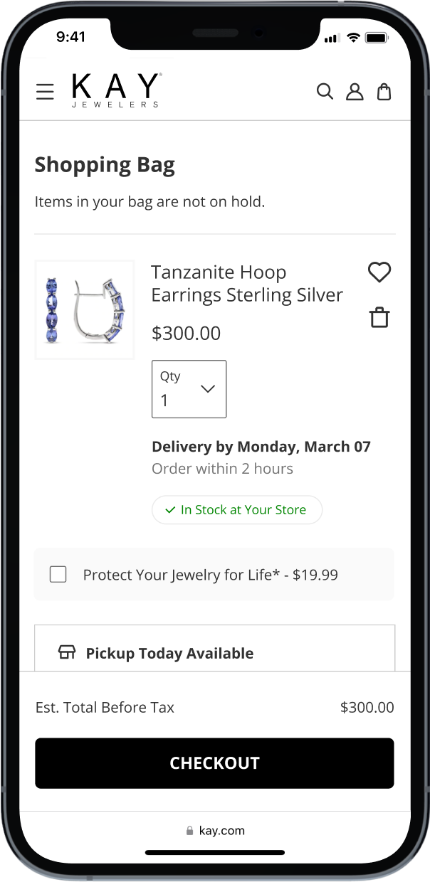
We started with a comprehensive analysis of the new program’s requirements. Engaging with cross-functional teams, we crafted a detailed project brief, identified potential challenges, and outlined key design considerations.
To make sense of the complex project requirements, I started exploring the potential user flows considering all the possible scenarios that depend on different variables.
Factors such as membership status, authenticated state, exclusions, order total, items in the bag, applied promos, promo hierarchy, and rewards expiration would all result in a different experience for the user.

Despite all the internal complexity, I wanted to create an experience as simple as possible for the end user, minimizing the friction before proceeding to checkout.
I explored different ideas through the lens of previously identified scenarios, highlighting the pros and cons of the user experience and technical debt.
With a tight timeline for the MVP release, I needed to design for an easy implementation. Some of the best user experiences required complex calculations and were not feasible in the short term, so we decided to put them out for the future and settle with alternative solutions.
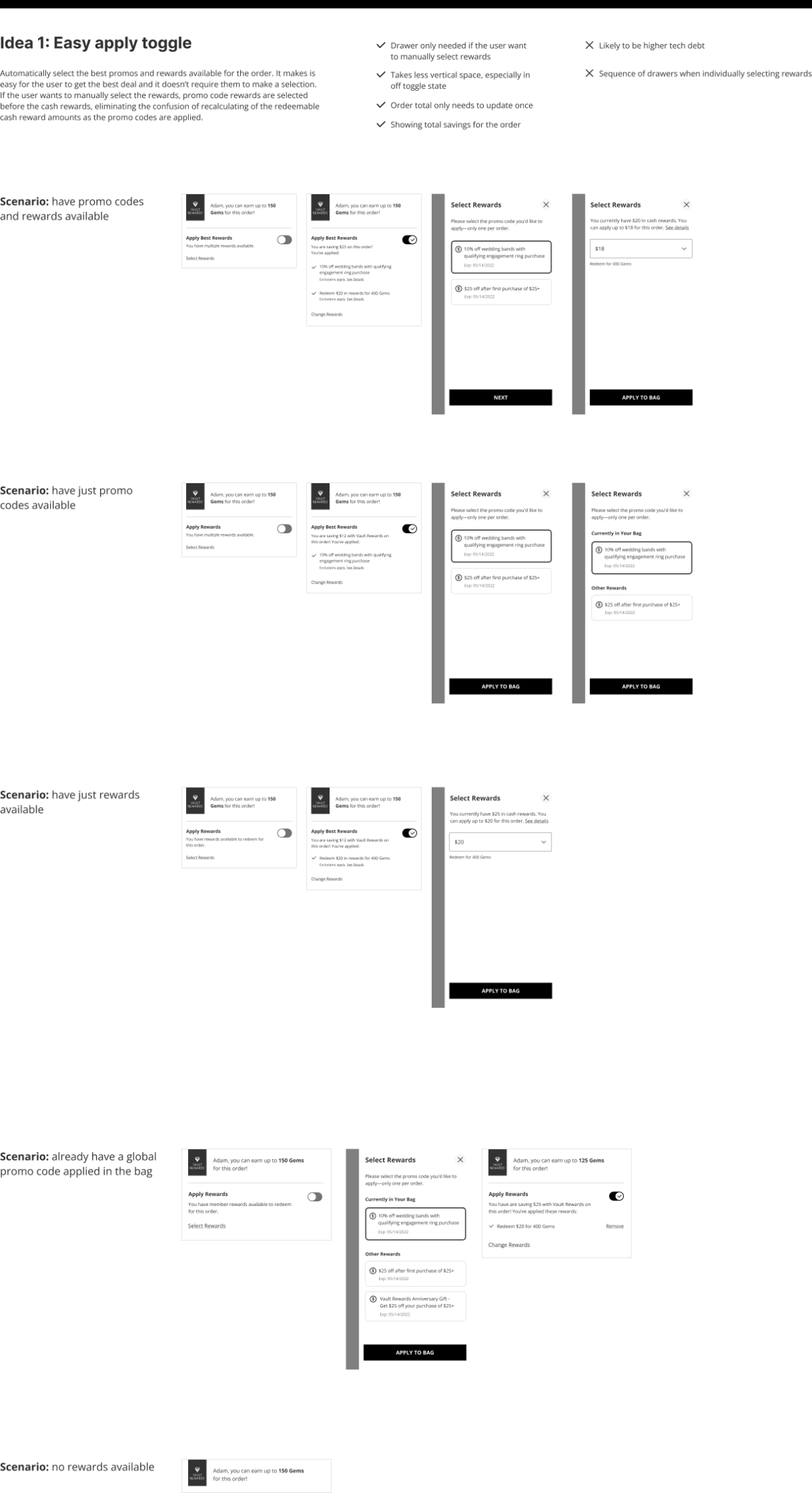
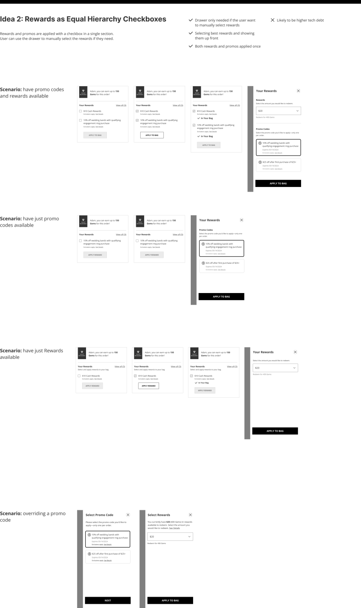
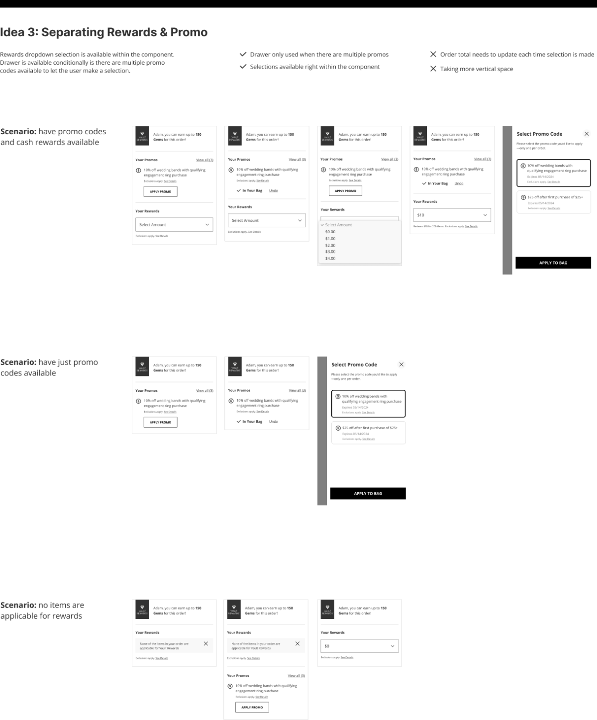
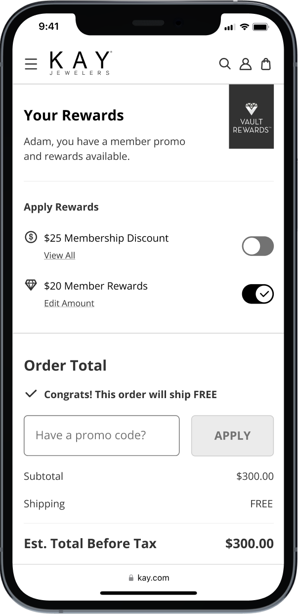
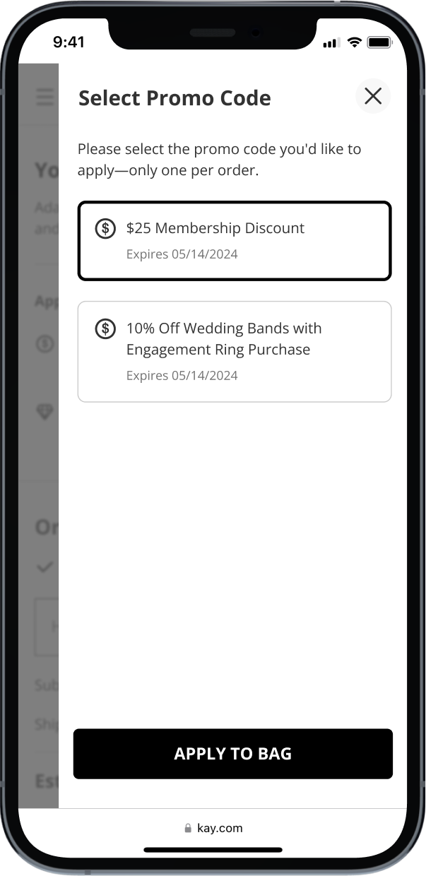
Customers with multiple promos available can either choose the best combination of promos and Rewards shown up front or make their selection within a drawer. It was important to visually communicate that only one promo code can be applied per order, while the Rewards can be redeemed in increments of one dollar.
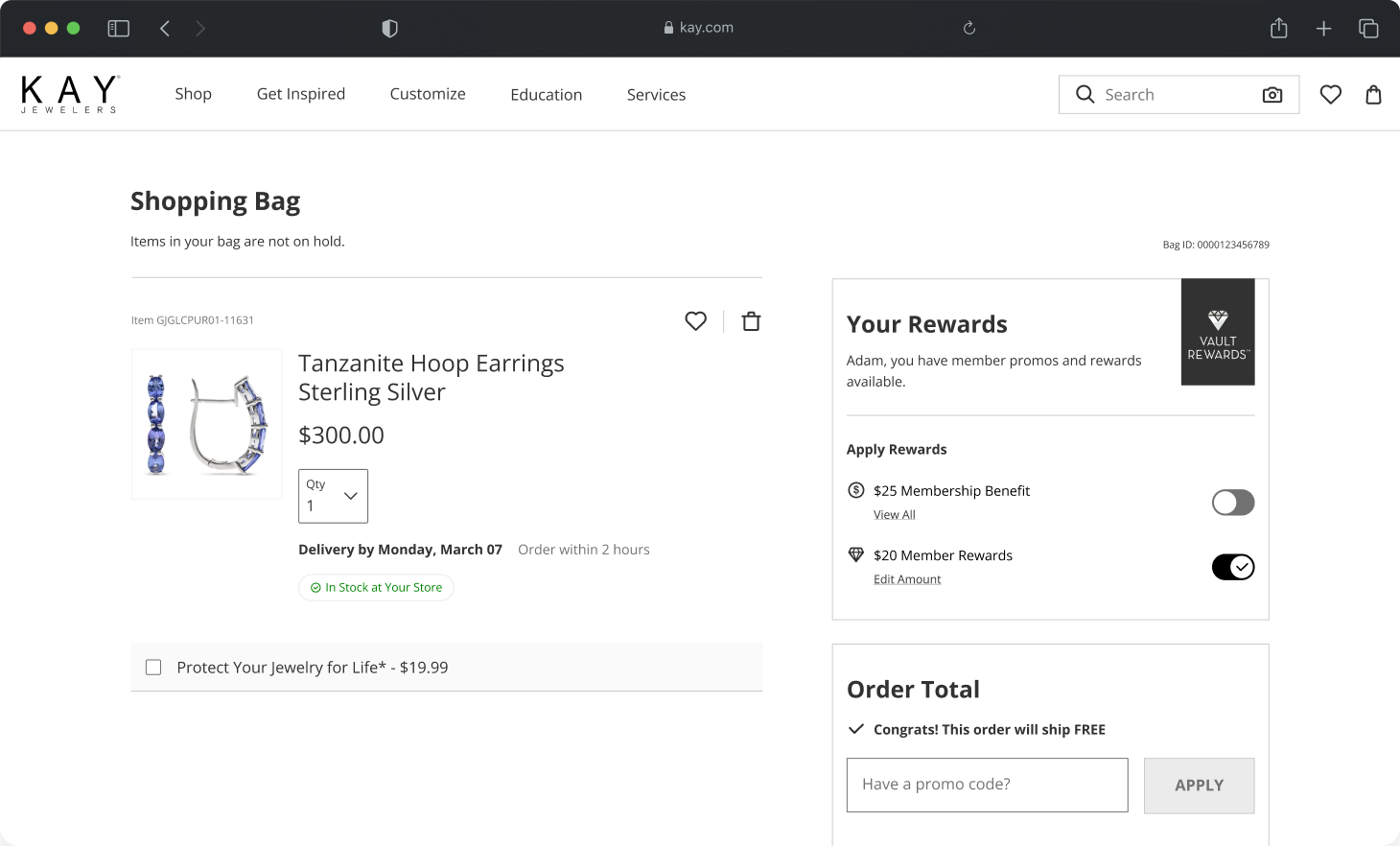
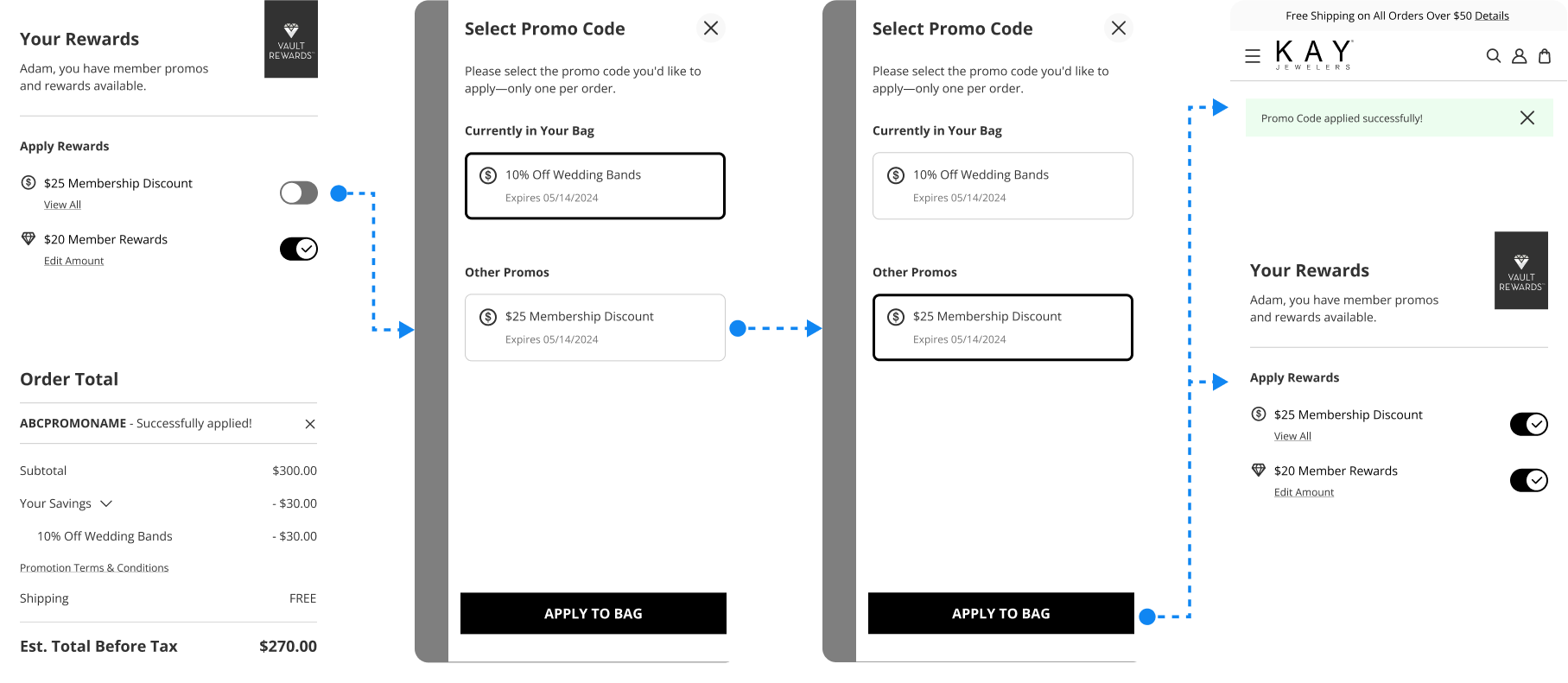
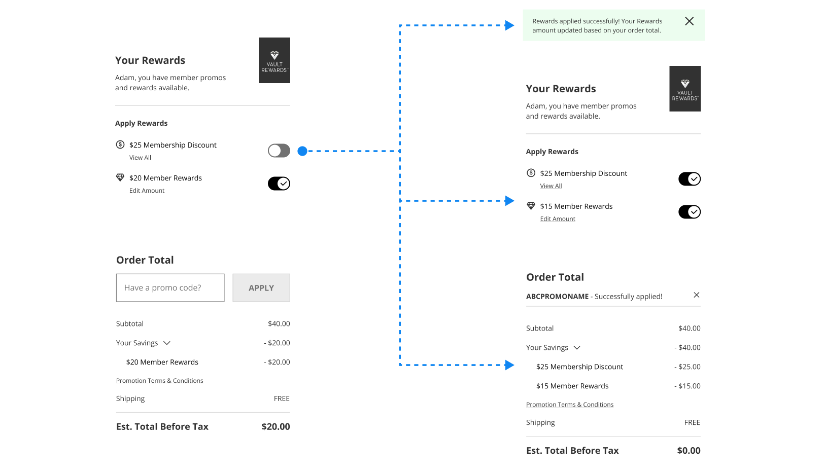
In the final experience, loyalty members can easily view their most valuable promos and Rewards based on the items in their shopping bag. Toggling a switch applies the Rewards with all the discounts reflected under the Order Total.
Collaborating closely with dev and product partners, I identified some of the edge cases that needed to be addressed in the design, such as considerations on what happens if the customer tries to override a promo code or if their Rewards reduce the order total below zero.

This project was a valuable demonstration of the advantages of involving cross-functional teams strategically early in the process.
Dialogue with the program team allowed us to fill the gaps in the program requirements identified through design exploration. Collaboration with the development team helped us find a common ground to translate the tech constraints to create a user-friendly experience.
While keeping the technical limitations top of mind presented a challenge in simplifying all the complexity, the additional effort invested to outline all the requirements was worthwhile, saving us a lot of time before committing to design.
If you would like to collaborate or learn more about my work, get in touch