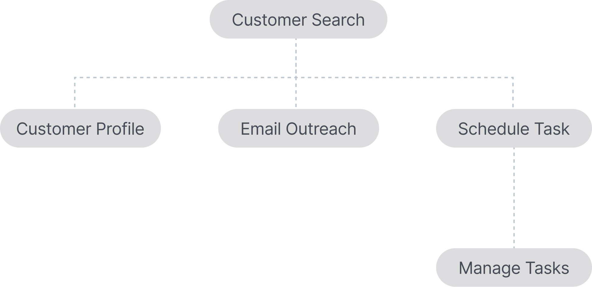
Store associates at Signet's stores use the Clienteling iPad app to build stronger relationships with customers through in-store interactions and personalized outreach for over 120M profiles.
Through Clienteling search, associates can find the right customers visiting stores or target them for outreach initiatives - for example to promote a new line of engagement rings to those who would be interested.
As the search capabilities kept evolving and new filters were added, the search experience became increasingly cluttered and harder to navigate. Many of the frequently used filters were hidden under the second navigation level, which led to poor discoverability.
New store associates struggled to find the right customers quickly, while experienced associates grew frustrated by the lack of easy access to key filters, slowing down outreach efforts and missing sales opportunities.
Our goal was to reduce friction and help store associates quickly find and act on the right customer profiles, making personalized outreach faster, easier, and more effective.
I led the end-to-end redesign of the customer filtering experience in collaboration with product managers, researchers, and engineers to simplify the search experience, improve filter accessibility, and drive better outreach outcomes.
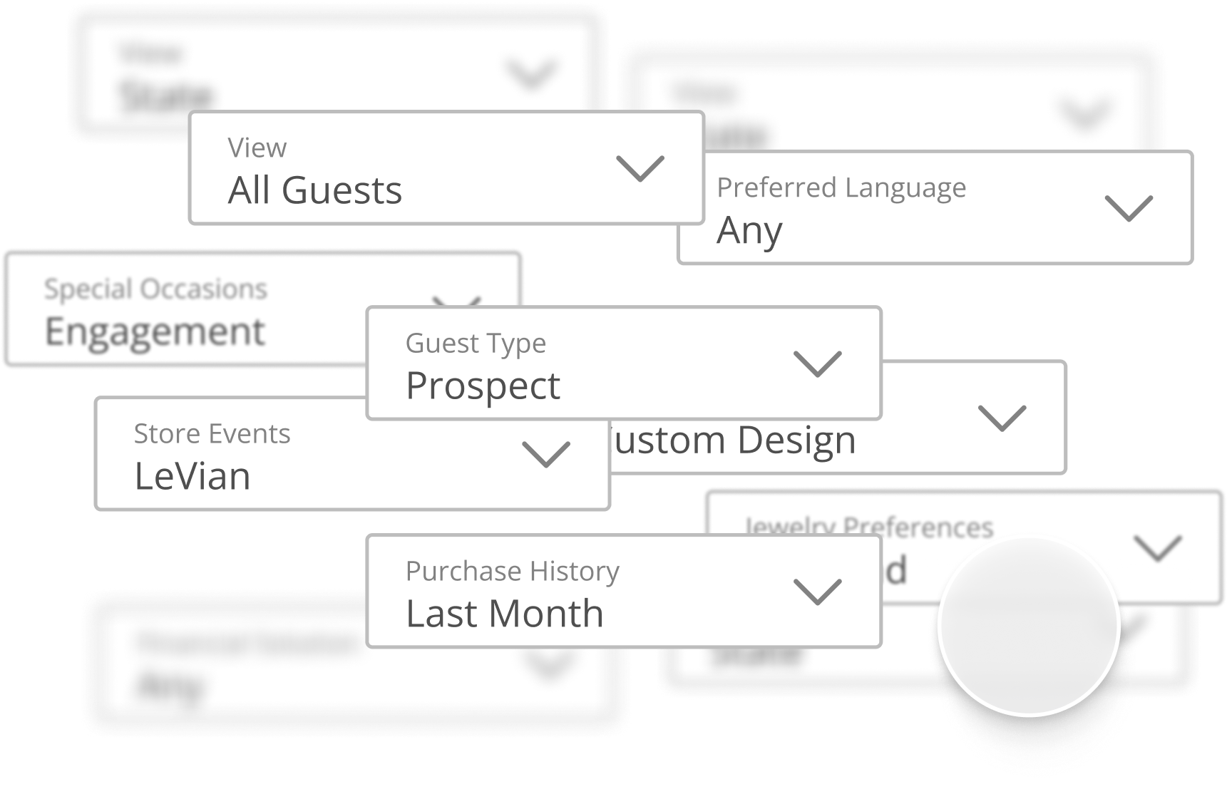
Two different filter variants we've tested with store associates
Design DirectionBecause how differently filters are used by new and experienced associates, my thought process was to design to balance simplicity and flexibility, reorganizing the filter architecture and applying progressive disclosure.
I explored two directions - a more familiar approach with categorized dropdowns and a progressive approach with a drawer. After testing them with store associates in-store, we've found that the drawer variant was significantly easier to use for both new and tenured associates.
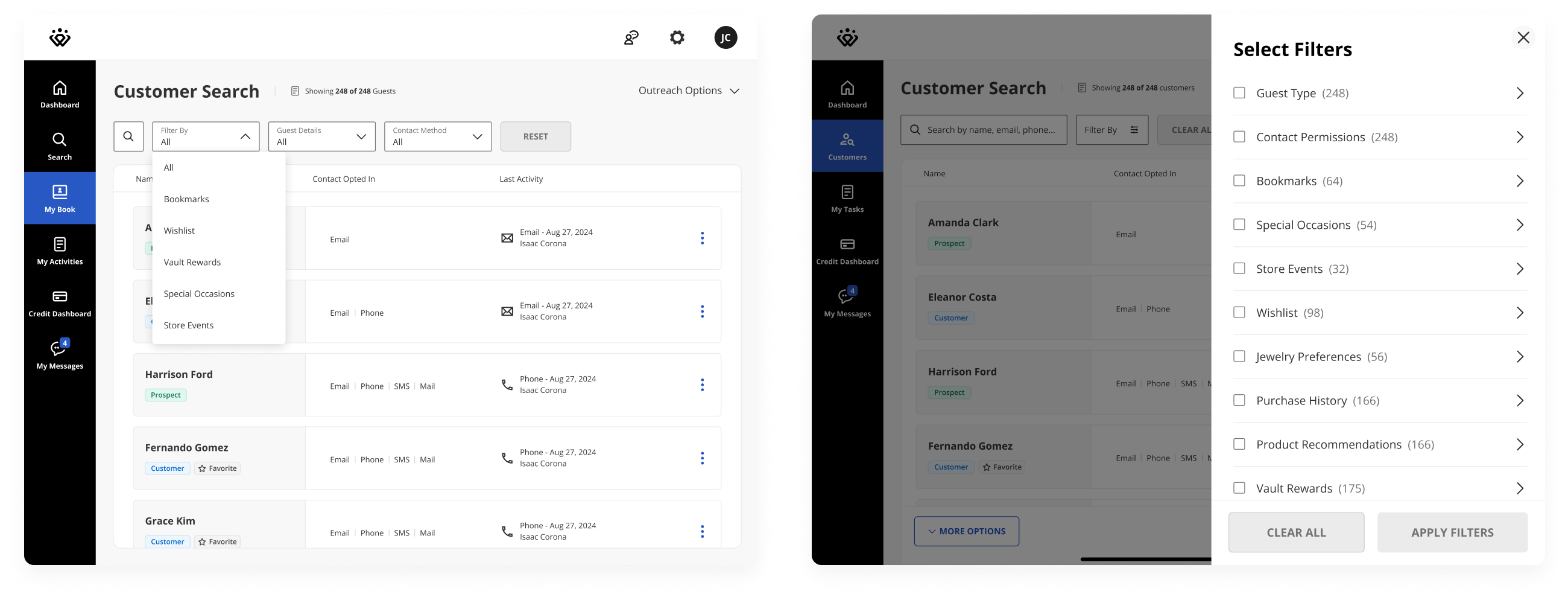
With the new customer filters, you can now...
- Quickly access the search bar to find specific customers
- View all filters and apply them from a single drawer
- Apply multiple filters at once for more personalized outreach
- Filter for specific contact methods and last outreach activity
Search bar
Previously, users had to select from a dropdown option to show a search bar. Now the search bar is directly accessible, allowing users to quickly find a specific customer.
New filter drawer
All filters are applied from a drawer, which creates a more focused experience, brings more visibility to all available filters, and better supports adding new filters in the future.
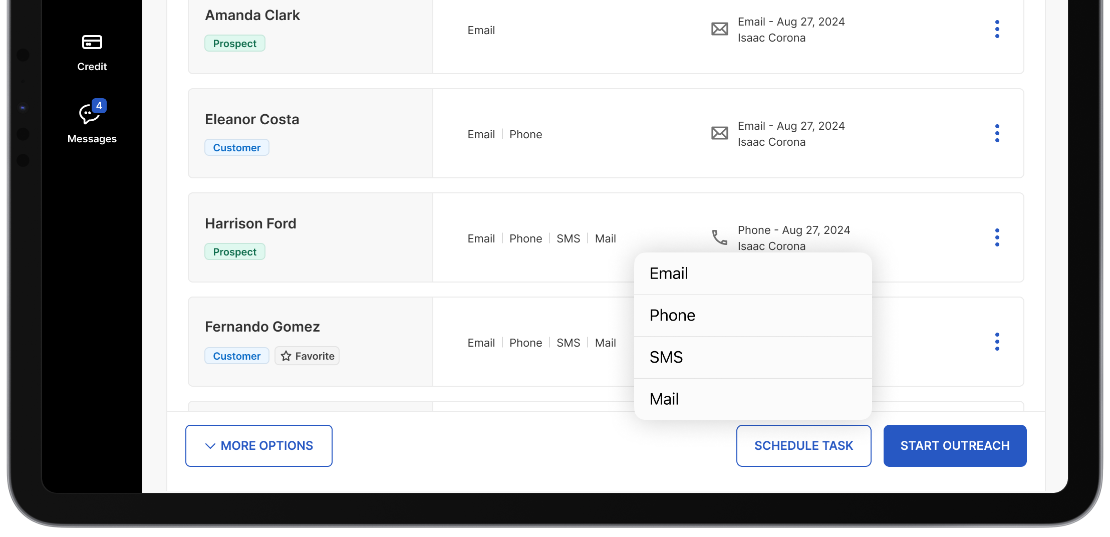
Contact methods
Previously, scheduled tasks had no specific outreach type which required the users to spend additional time to view the customer profile in search of available contact information.
Store associates can now see the contact methods customers are opted-into and filter them to schedule a method-specific task.
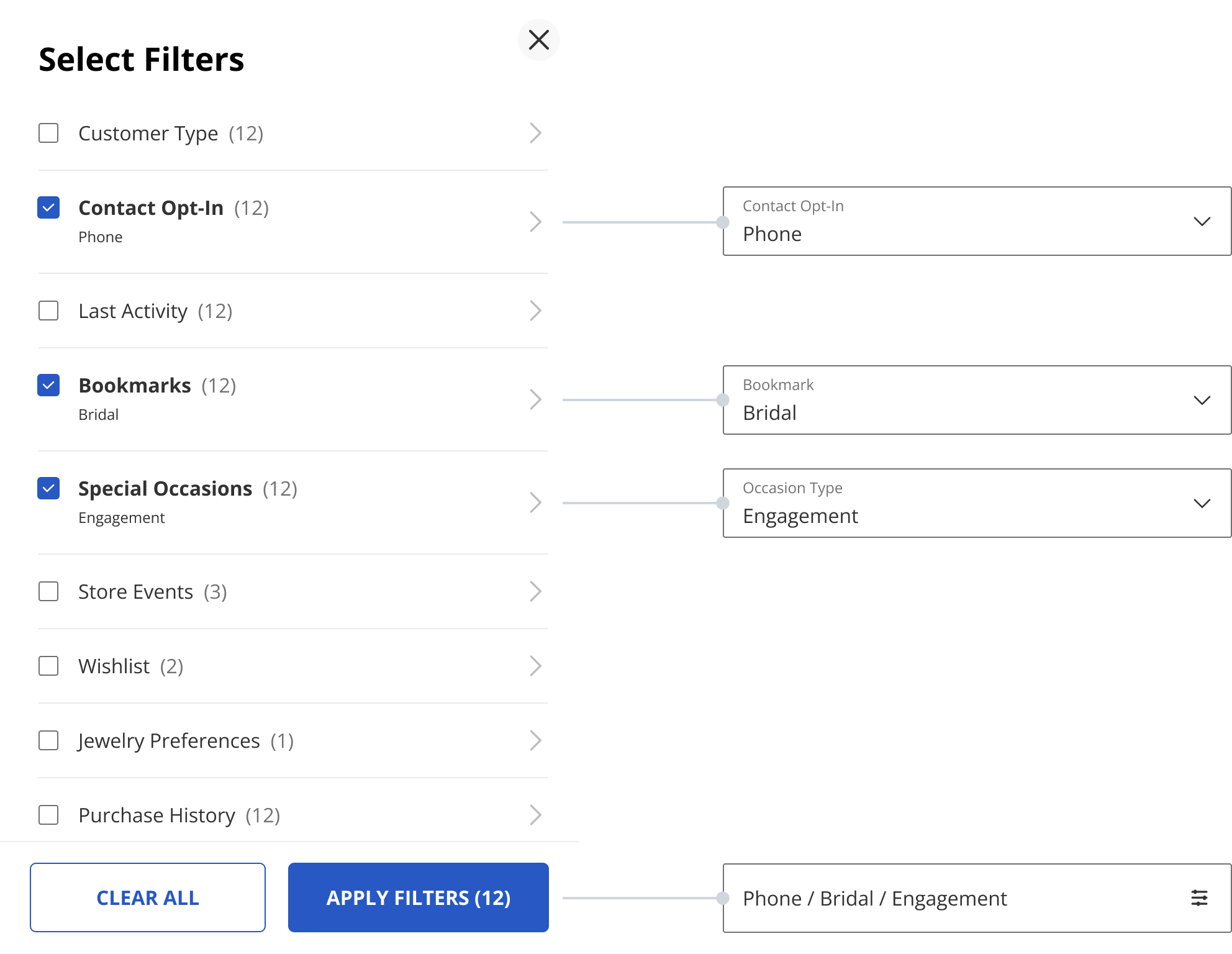
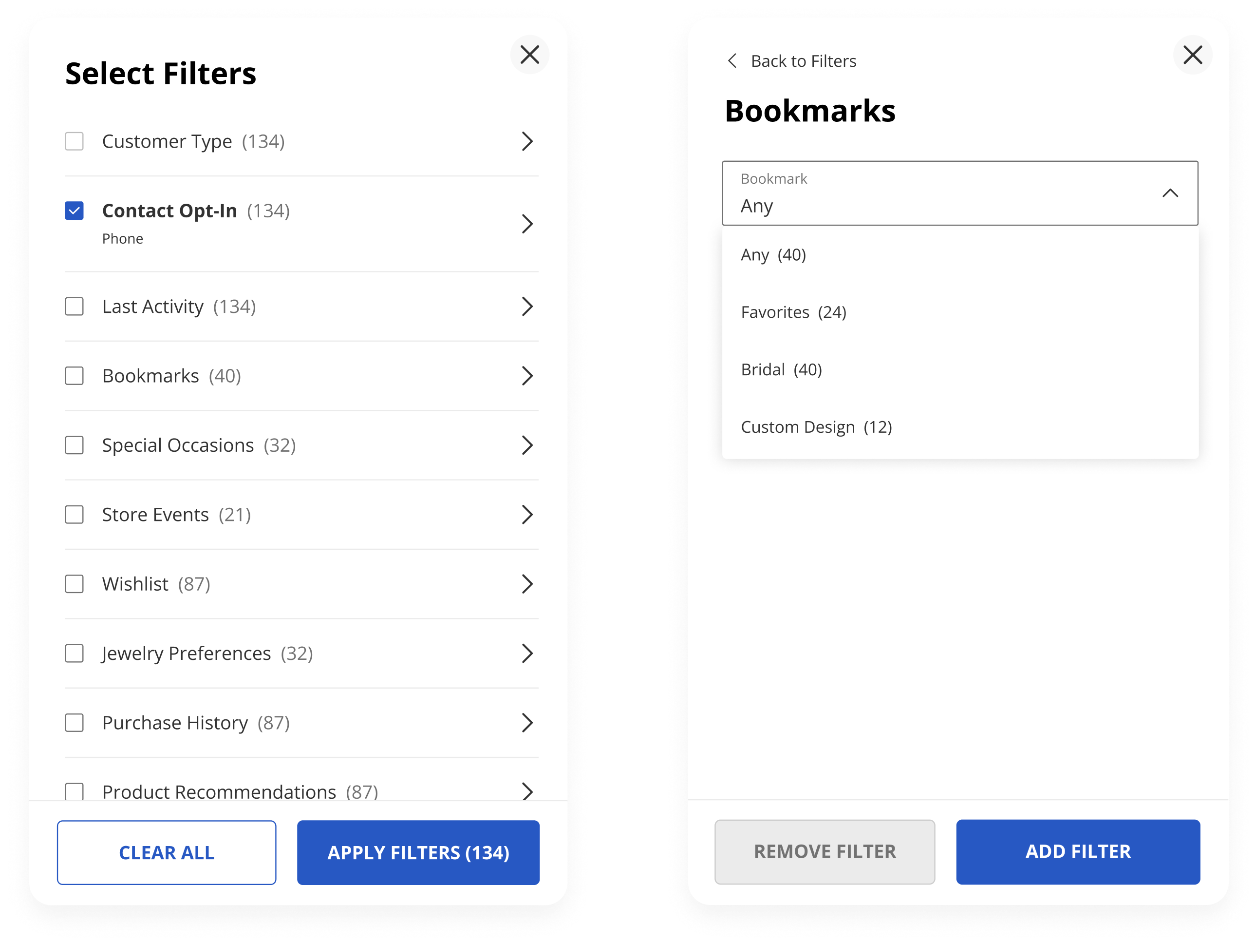
Faceted filters
Multiple filters can be applied at the same time, allowing for a more personalized outreach. The numbers next to each filter update with each selection, representing the customers who belong to that segment.
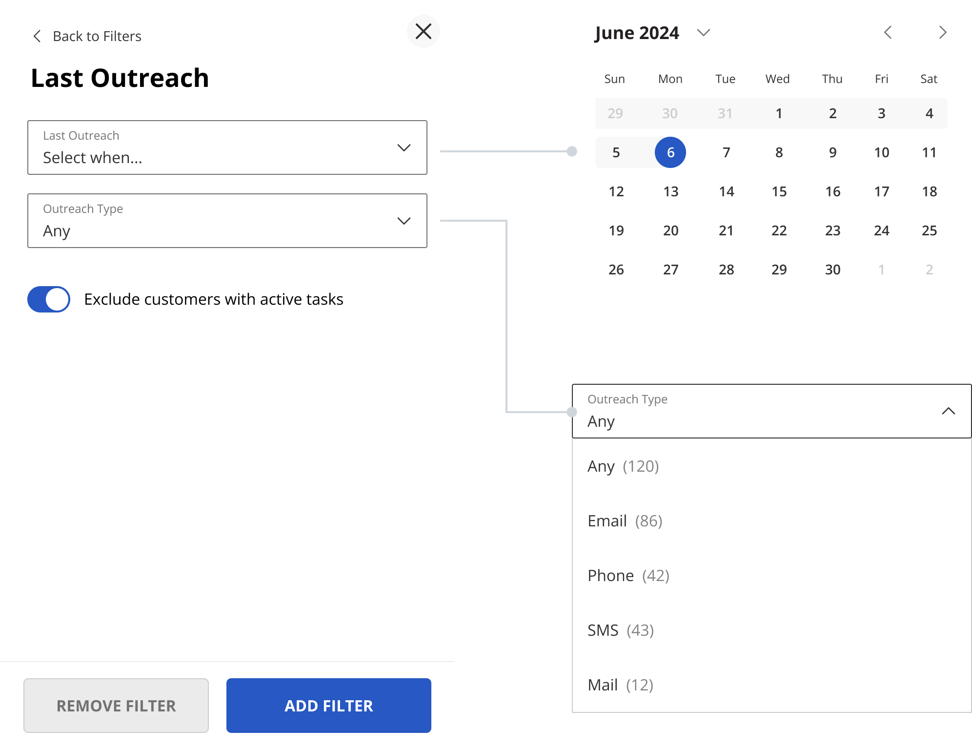
Last outreach filter
One of the pain points was finding when was the last time each customer was contacted to avoid spam.
I added a new Last Outreach filter which allows to filter customers who haven't been contacted in a while and also exclude customers who already have a scheduled outreach task.
The new design offered a simple and approachable filtering experience for new employees, while maintaining the functionality and flexibility appreciated by tenured store associates.
Through the combination of the changes, six months after launch, we saw a 750% increase in email engagement, 50% increase in outreach tasks engagement and received positive feedback from associates that new filters felt faster to use and more intuitive.
TakeawaysThis project was part of a larger initiative and it was a great learning opportunity because of its broad scope and complexity. Here are some of the personal learnings:
- Understanding how changes to product features can impact the app in the larger context
- Building and continuing the collaboration momentum with multiple teams on the project from start to finish
- Balancing the needs of new employees and power users
- Keeping the user testing sessions short, and prototypes simple to retain participant engagement
If you would like to collaborate or learn more about my work, get in touch