Amor is a design system built to ensure uniform and accessible e-commerce experiences on a large scale across multiple Signet brands. While it worked well for our shop and checkout experiences, its implementation wasn't as successful for the content pages managed by our marketing teams.
My role involved developing a set of reusable content components in Figma and Hybris (our CMS) that encompassed marketing materials with supporting documentation, leveraging the visual language established in the Amor design system.
The redesigned CMS tool, improved the efficiency of our marketing team's content management processes, currently with over 4,000 components in use across our websites.
Speed of creating a page using new components
Leveraging Design SystemAn audit of Signet's content pages was necessary from both design and engineering perspective. We used 68 different fonts and 41 colors across five websites at the time, which was a severe performance concern.
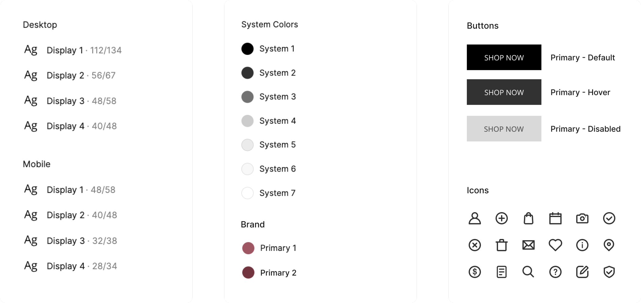
When building the new components, I started to standardize our use of color and typography, extending the visual language defined in our design system. This effort helped content authors create new marketing material at velocity and maintain a consistent brand experience.

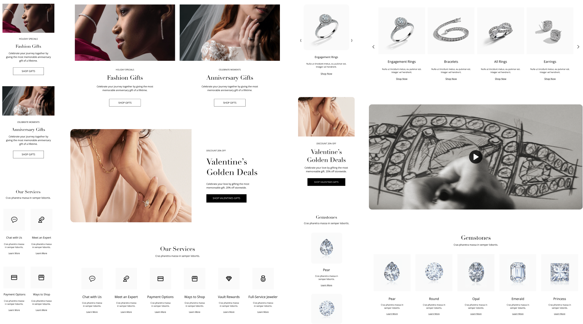
Documenting content patterns found across hundreds of pages helped define the scope for the initial batch of components. The new components standardized the most commonly used content patterns and provided better guidance based on the intent behind adding content. These components set the groundwork for creating page templates.

Individual brand expression implemented via typography, language, color, and imagery
Responsive DesignIn the past, content authors designed adaptive pages relying primarily on CSS media queries, requiring a separate desktop and mobile code. The new components eliminated the struggle of developing for different devices by having a pre-defined responsive behavior.
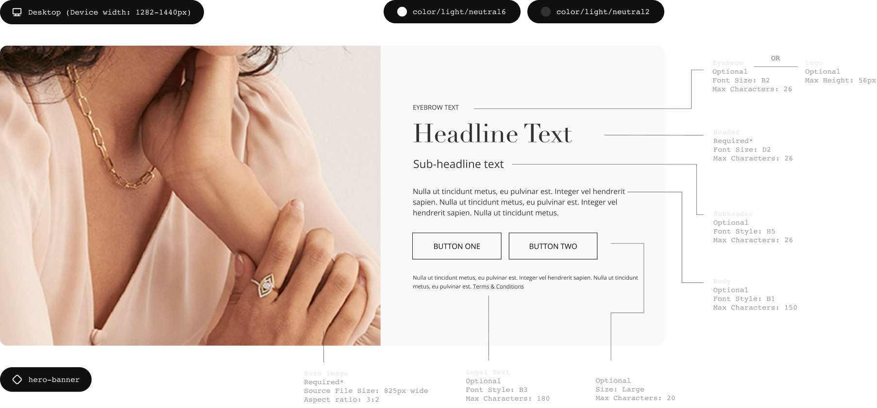
Dynamic PropertiesContent authors can choose different properties within a component or toggle elements on and off. This functionality was embedded both within Figma and Hybris, helping us maintain simplicity and clear content hierarchy.
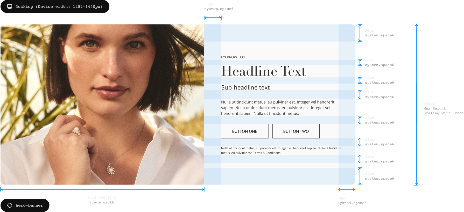
Component DocumentationCollaborating with developers, I created detailed documentation for each component around its typography, spacing, colors, dimensions, and character limits. Keyboard navigation for carousels, header hierarchy, and a space to add alt text in Hybris were also part of the considerations for accessible design.
Specifications on usage and examples helped designers and the marketing team understand how to start using components. Amor Content Components are a part of our Figma library, and anyone can access their documentation in ZeroHeight.


Design Systems are only successful when they can be easily used by anyone working on the product. For this project, I partnered with our design system team to develop guidelines and training materials, advocating for the adoption, maintenance, and upkeep of components and documentation. We developed an intake process to submit new component requests or updates to support contributions from our designers and marketing teams.
ImpactAmor Content Components have empowered everyone in the organization to launch new marketing pages rapidly and consistently, improving our website's interface with confidence. Year after their release, we've have recorded over 4,000 component instances used across our websites.
If you would like to collaborate or learn more about my work, get in touch